First Thursday
CLIENT
Natalie Phillips
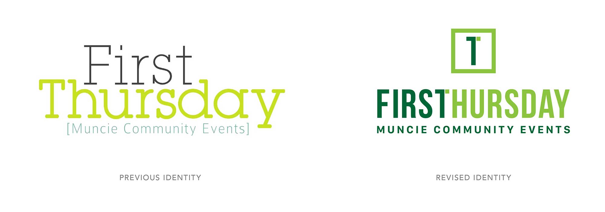
First Thursday is a monthly arts and culture event that has brought together artists, businesses, and community members in Downtown Muncie since 2001. The goal was to create a visual identity that could represent the event’s diverse creative programming while remaining simple, recognizable, and adaptable across years of use.
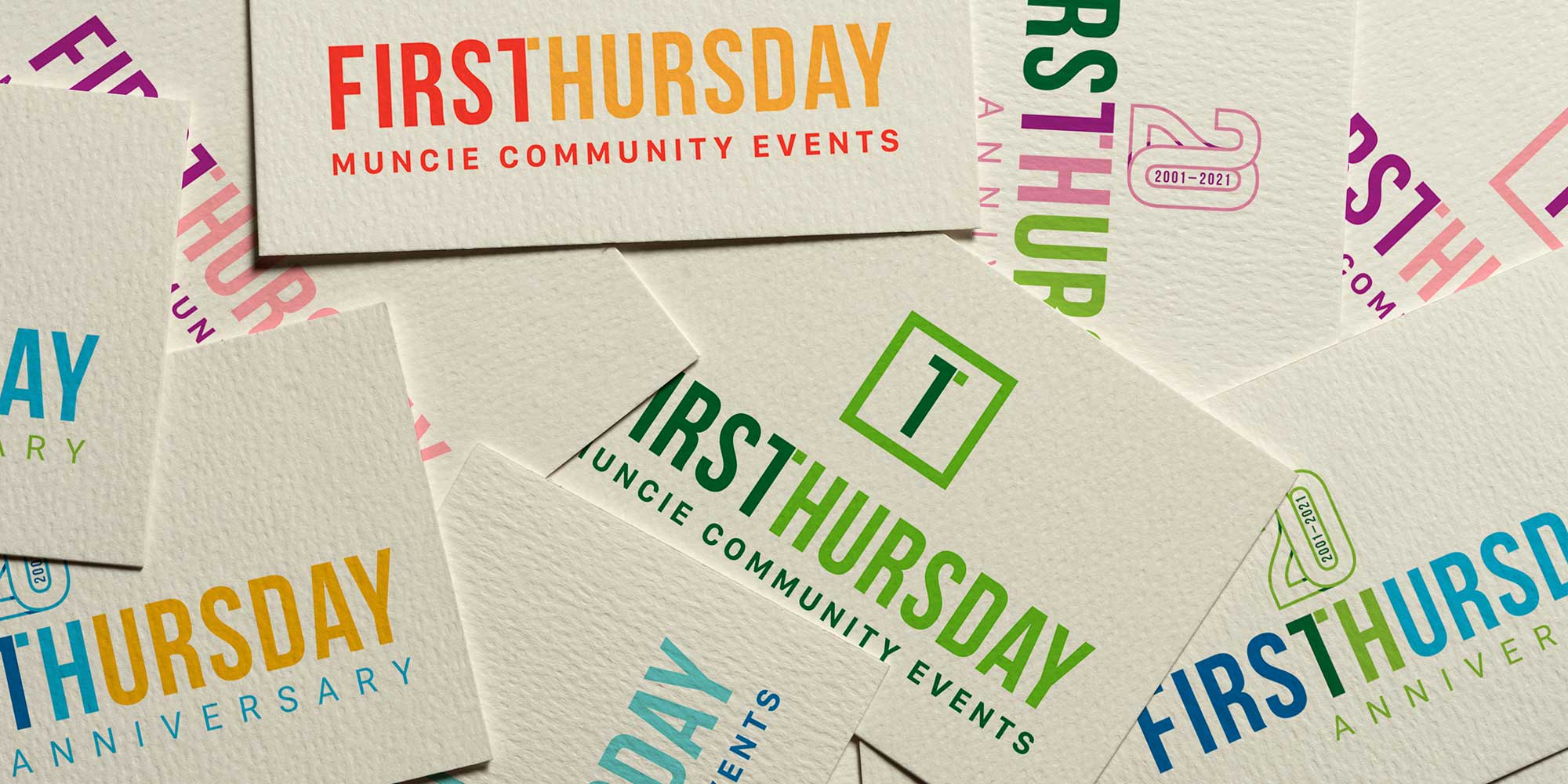
Rather than referencing a specific art form or style, I focused on typography to create a timeless identity. The custom wordmark merges the shared “T” between First and Thursday into a single character that functions as both the number “1” and the letter “T”—a subtle visual reference to the event’s name.
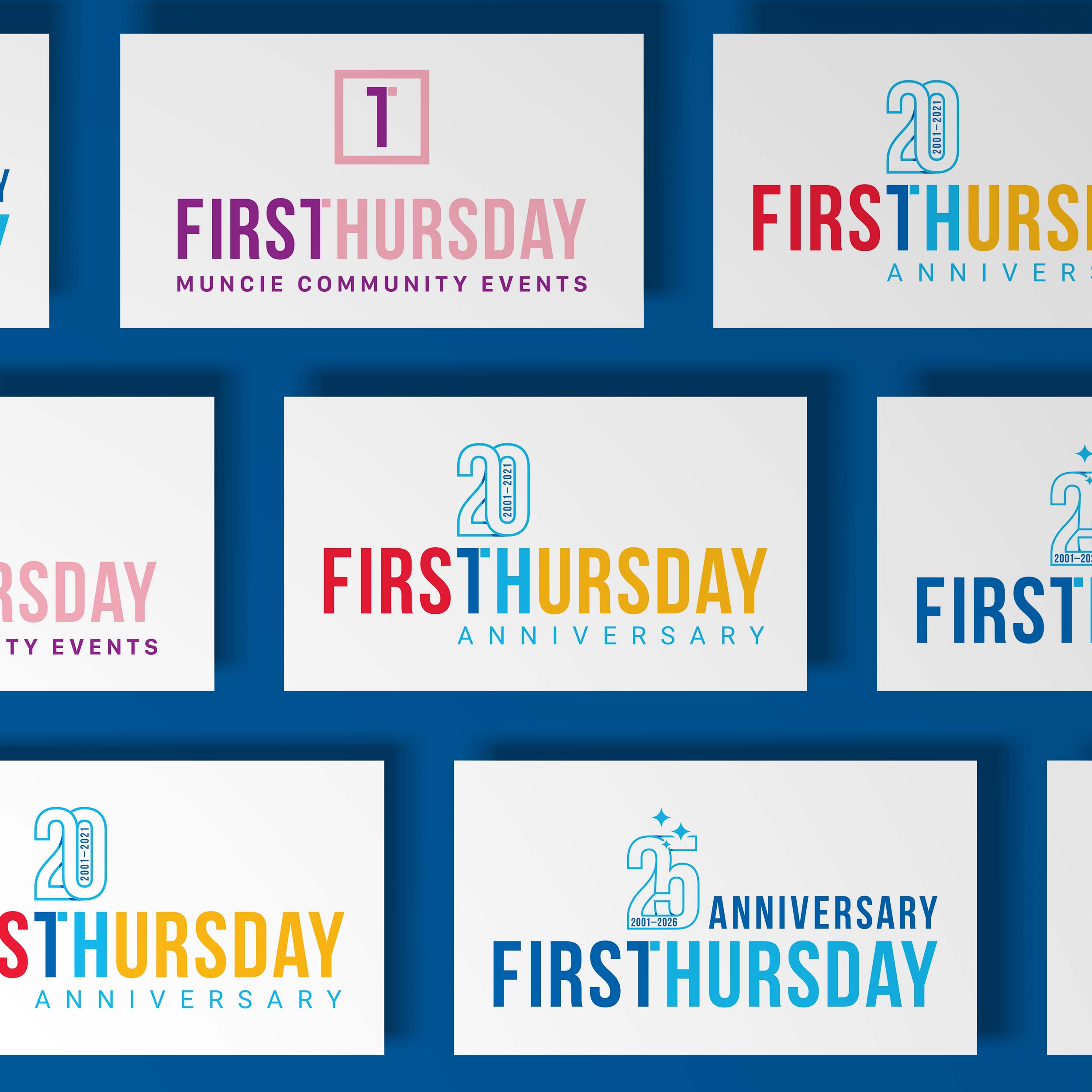
For the 20th and 25th anniversary celebrations, I developed commemorative versions of the mark that integrated the milestone directly into the typography. The anniversary treatment adds a celebratory layer without changing the core identity, allowing the brand to evolve while remaining familiar to the community.
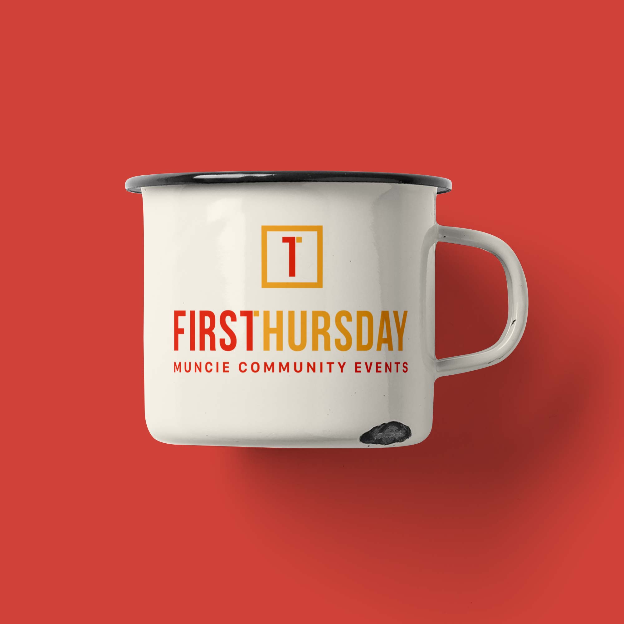
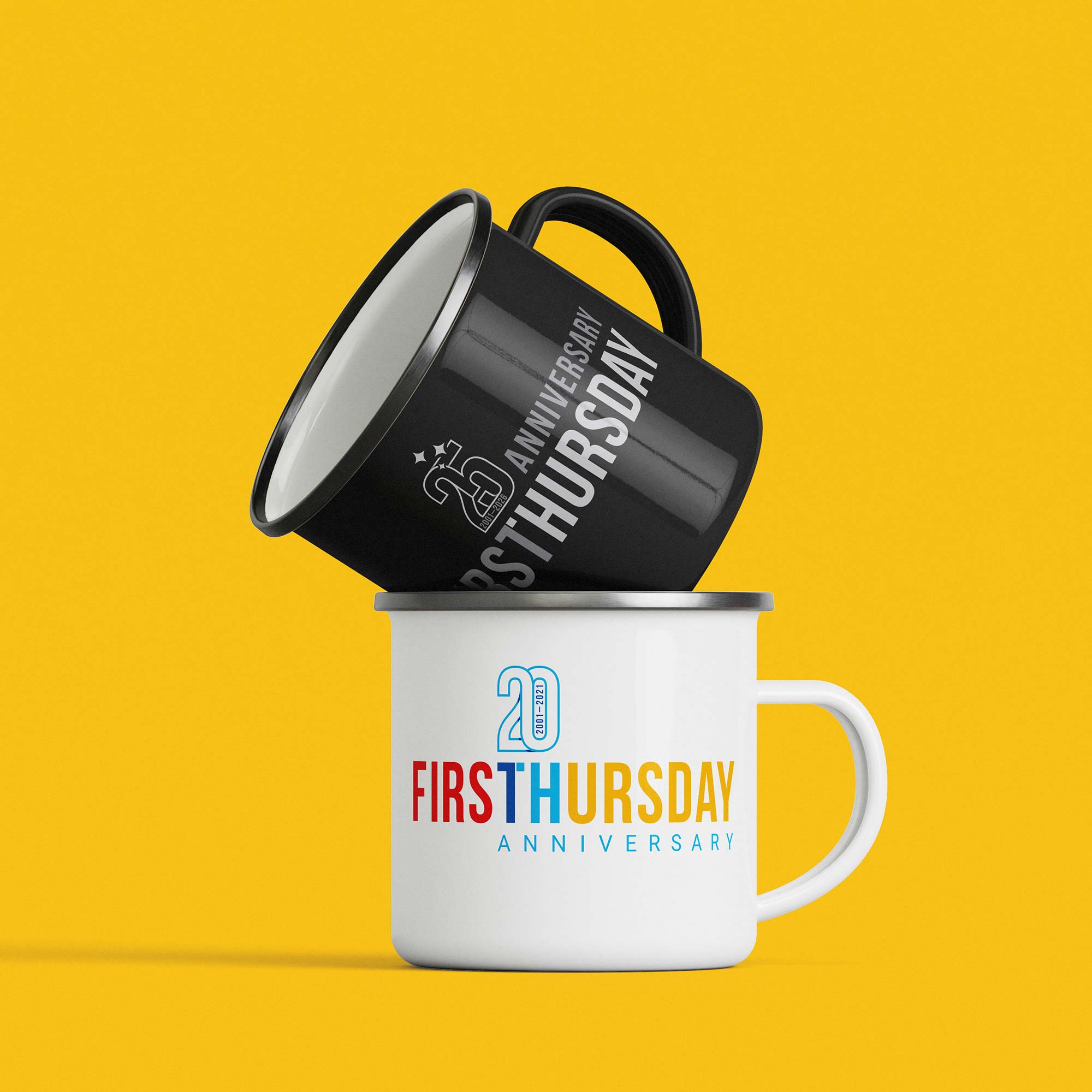
The result is a clean and flexible identity system that works across signage, posters, merchandise, and digital platforms while reflecting the event’s long-standing role in Muncie’s creative community.