Sweet Farm Sauerkraut
COLLABORATORS
Marisa Falcigno (Co-designer)
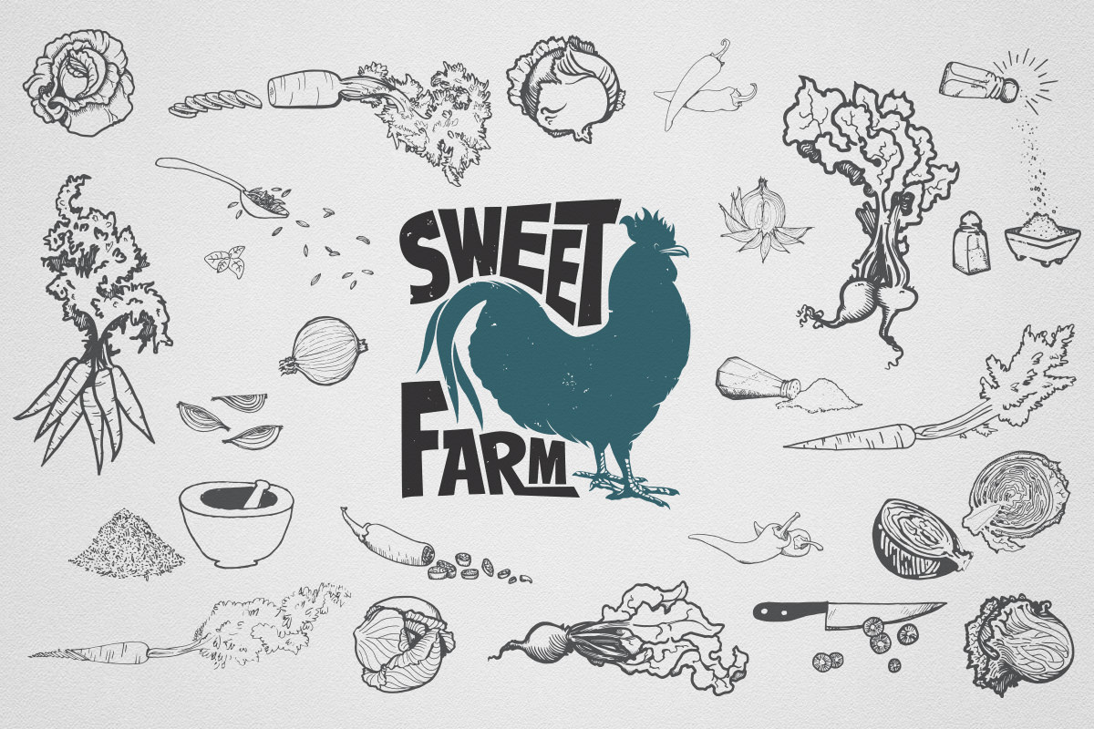
Camille Demarinis (Illustrator)
CLIENT
Sweet Farm, Maryland
RECOGNITION
Print Regional Design Annual 2015
The Dieline
Packaging of the World
Sweet Farm, located in Western Maryland, focuses on sustainability in its food production, building, and daily living. It is also the home of Sweet Farm Sauerkraut. They came to us looking for a new identity and packaging labels as the farm and farm offerings were quickly growing.
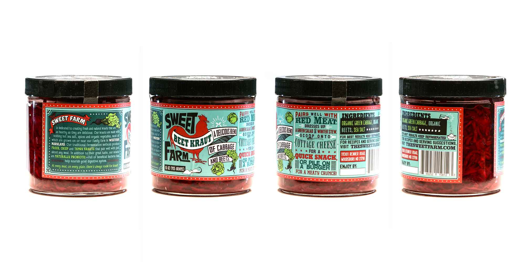
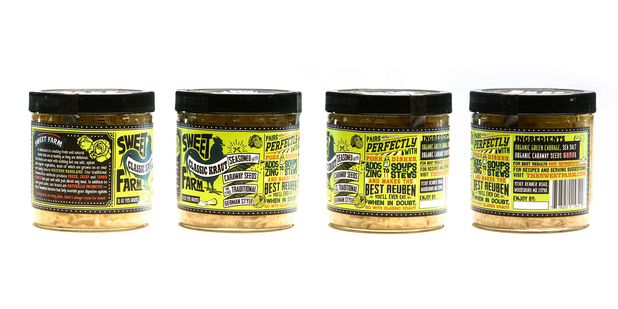
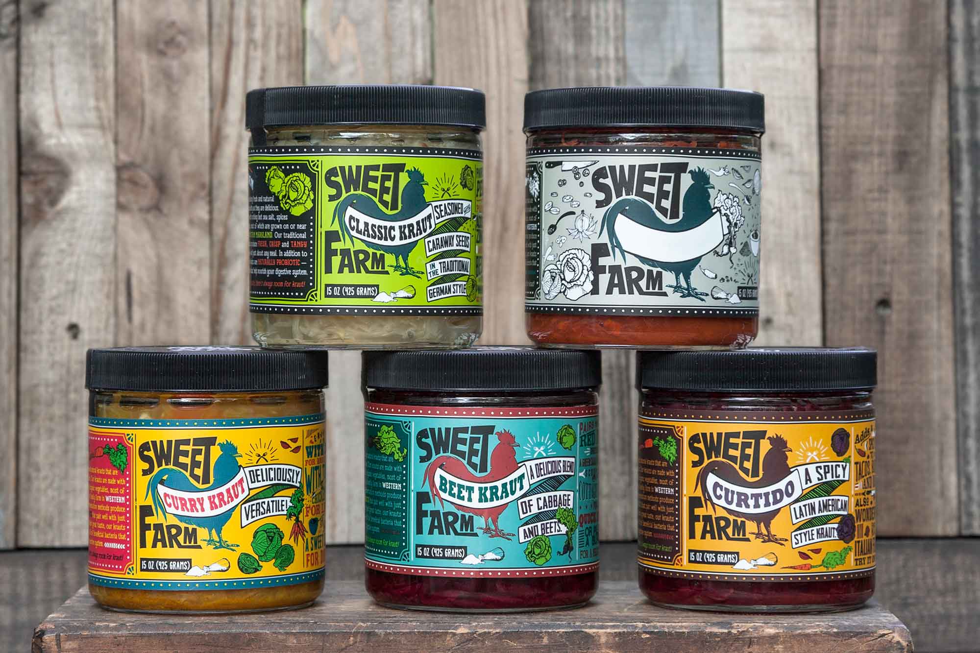
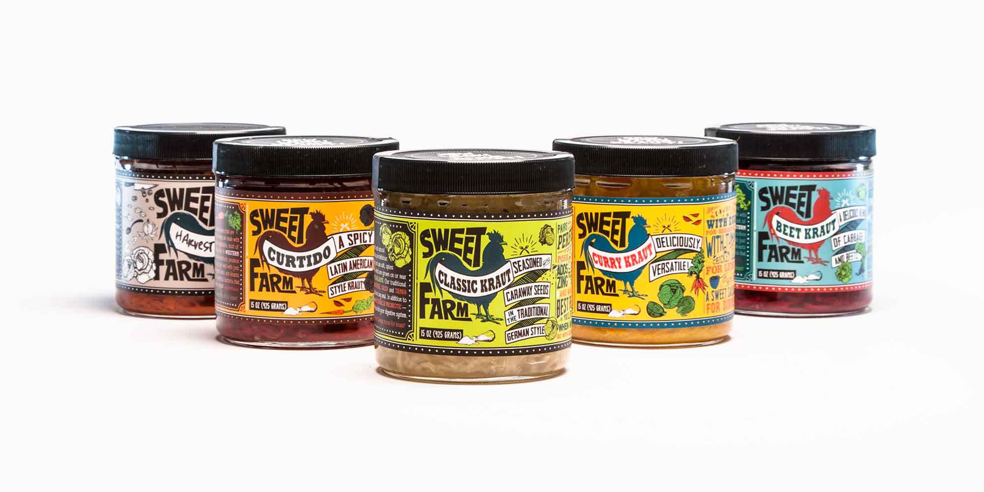
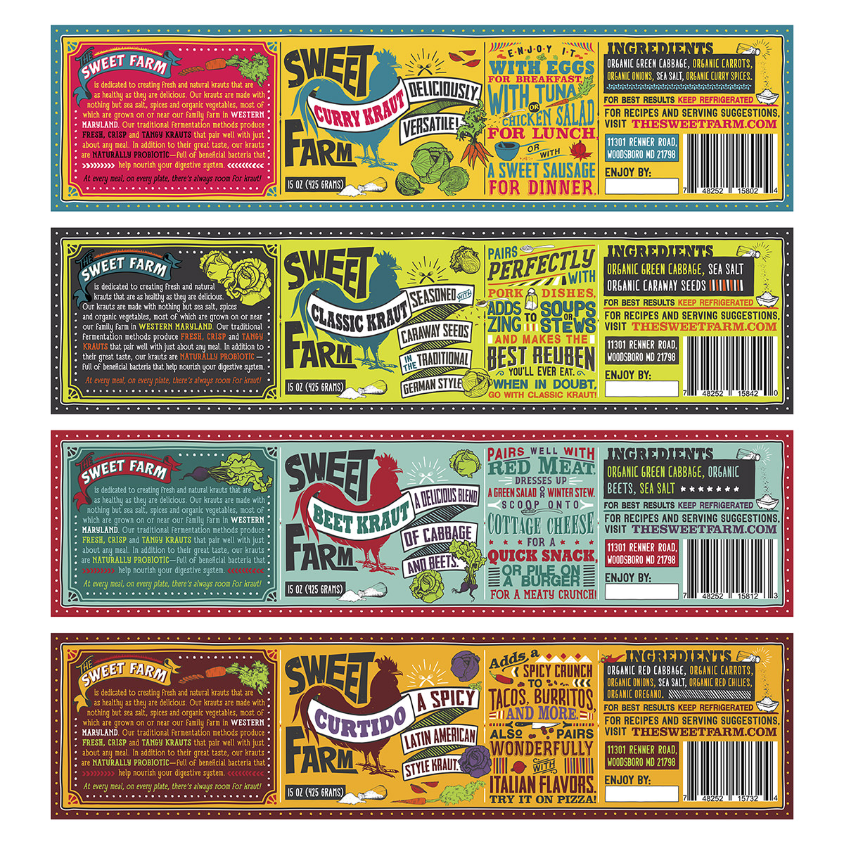
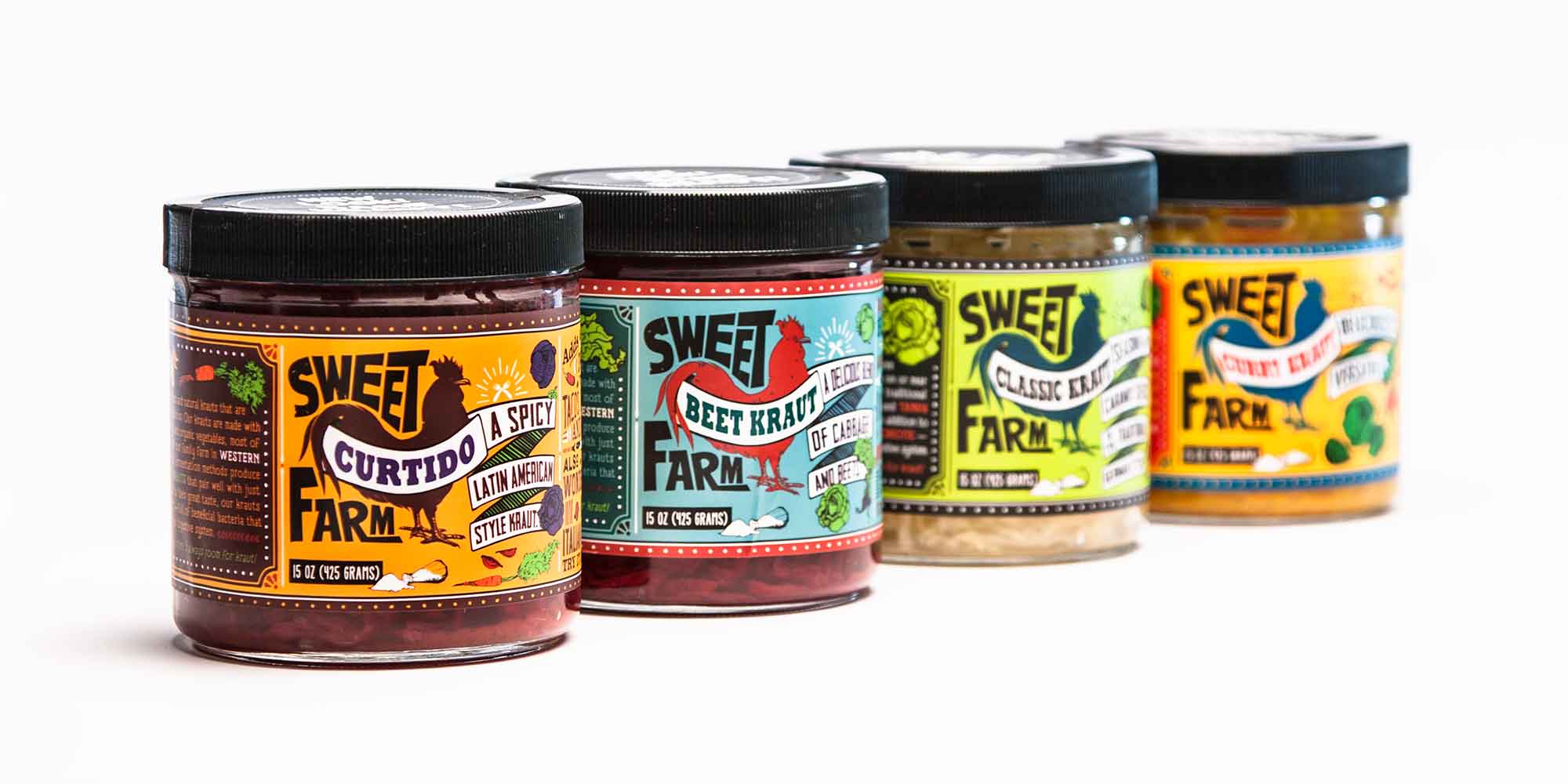
Our work for Sweet Farm was a multi-phased approach, starting with the identity design and then followed by label design. Ever since the brand was launched, Sweet Farm has used the image of a rooster to represent themselves—a symbol of good luck, health, pride, and honesty. Keeping the rooster image integral to their identity design, Sweet Farm wanted to provide a facelift to the overall Sweet Farm branding. The redesign brought to life a playful look that was used across all of their marketing materials.
According to the client, “The Sweet Farm is dedicated to creating fresh and natural krauts that are as healthy as they are delicious.” In simple words, we think they make amazing kraut!
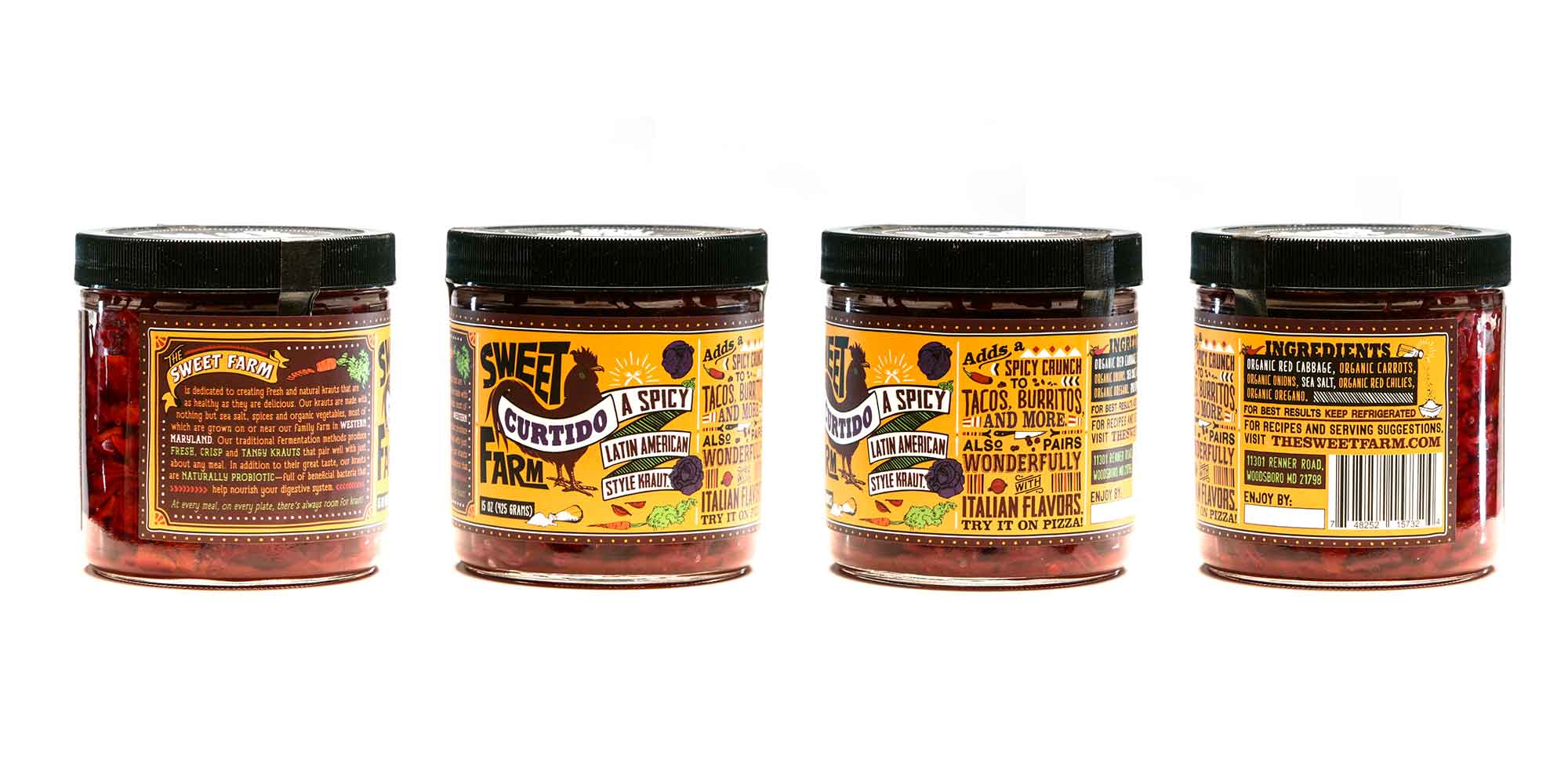
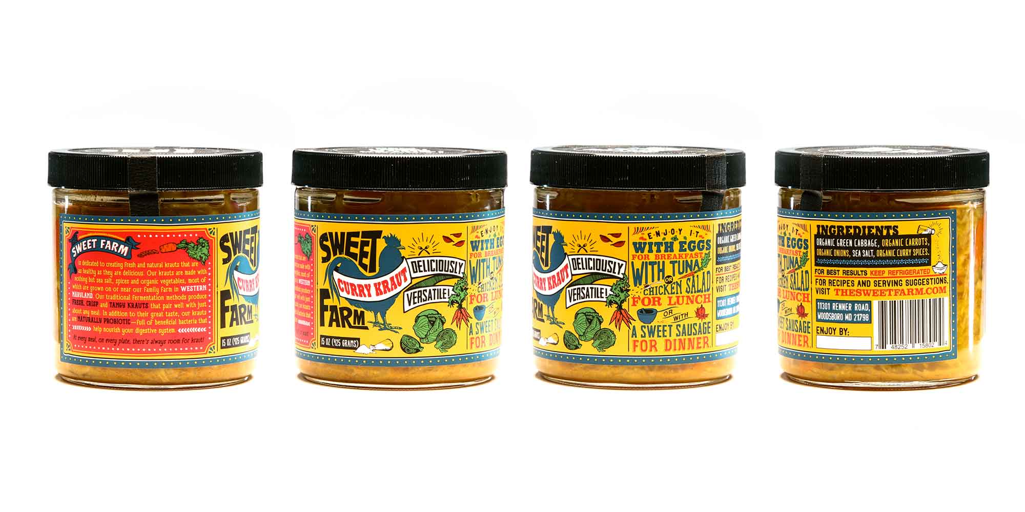
After deciding to upgrade their packaging from plastic containers to glass jars, Sweet Farm needed new labels for each of their krauts: Curtido, Curry, Beet, and Classic Kraut. The fact that each kraut had its own flavor resulted in the creation of a range of unique label designs. Each label was color coordinated by the spices and cultural background of the kraut it represented. (e.g. the Indian-inspired Curry Kraut carried vibrant and rich tones of pink, blue and yellow). The hand-drawn illustrations — helped in establishing the values of Sweet Farm to use fresh and organic vegetables for each kraut. Even the typography had been designed to reinstate the playful nature of the brand.