Tania Said Consulting

CLIENT
Tania Said
RECOGNITION
Graphis Design Annual 2024 (Honorable Mention)
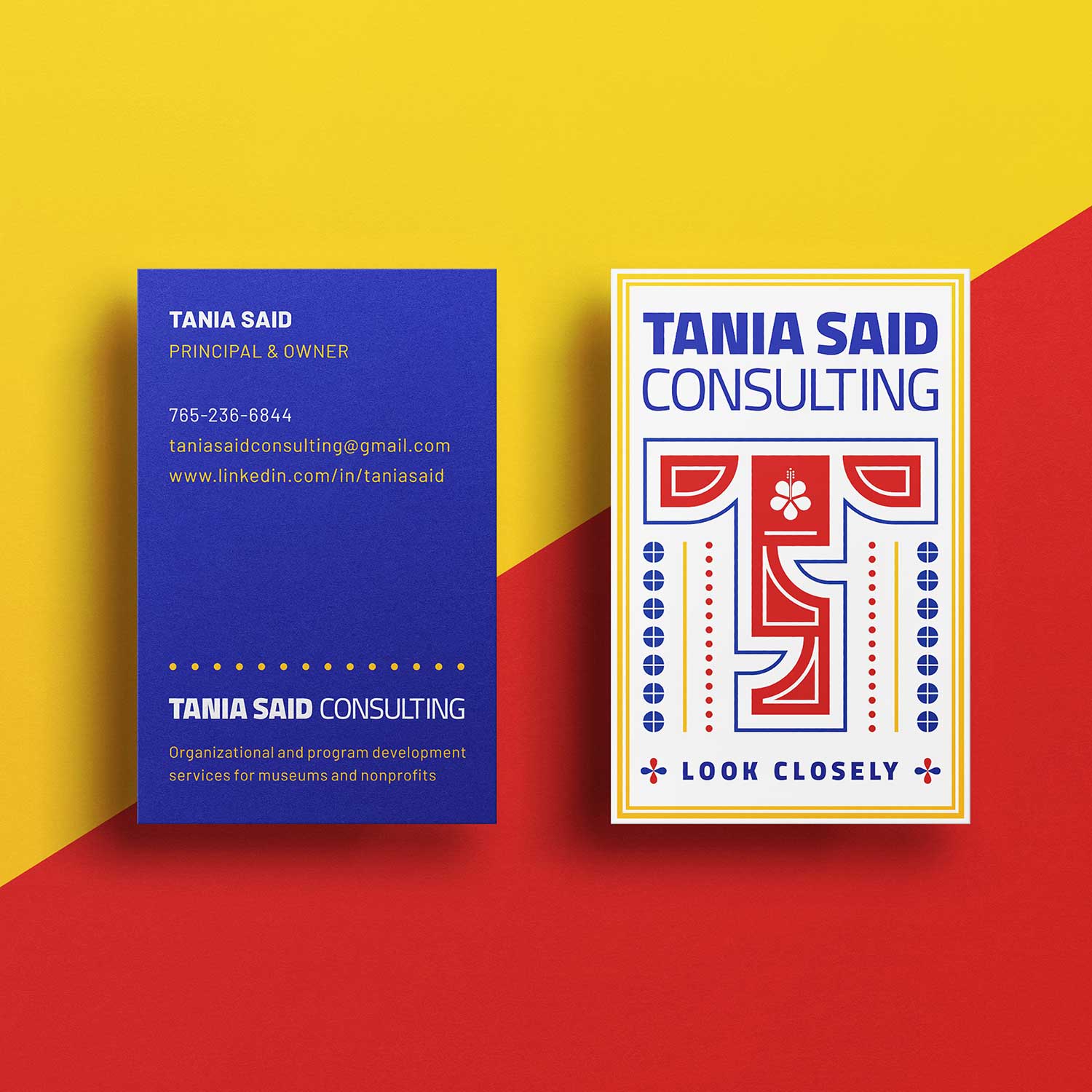
Tania Said launched her consulting practice after more than 30 years of leadership experience across museums, higher education, government, and nonprofit organizations. She needed a visual identity that reflected her international perspective, commitment to equity, and Malaysian-English heritage.
The identity is built around the initials “T” and “S.” At first glance, the mark appears abstract, but a closer look reveals conversational shapes that form the two letters. These elements symbolize dialogue, collaboration, and the strong relationships that are central to Tania’s work with organizations and community leaders.
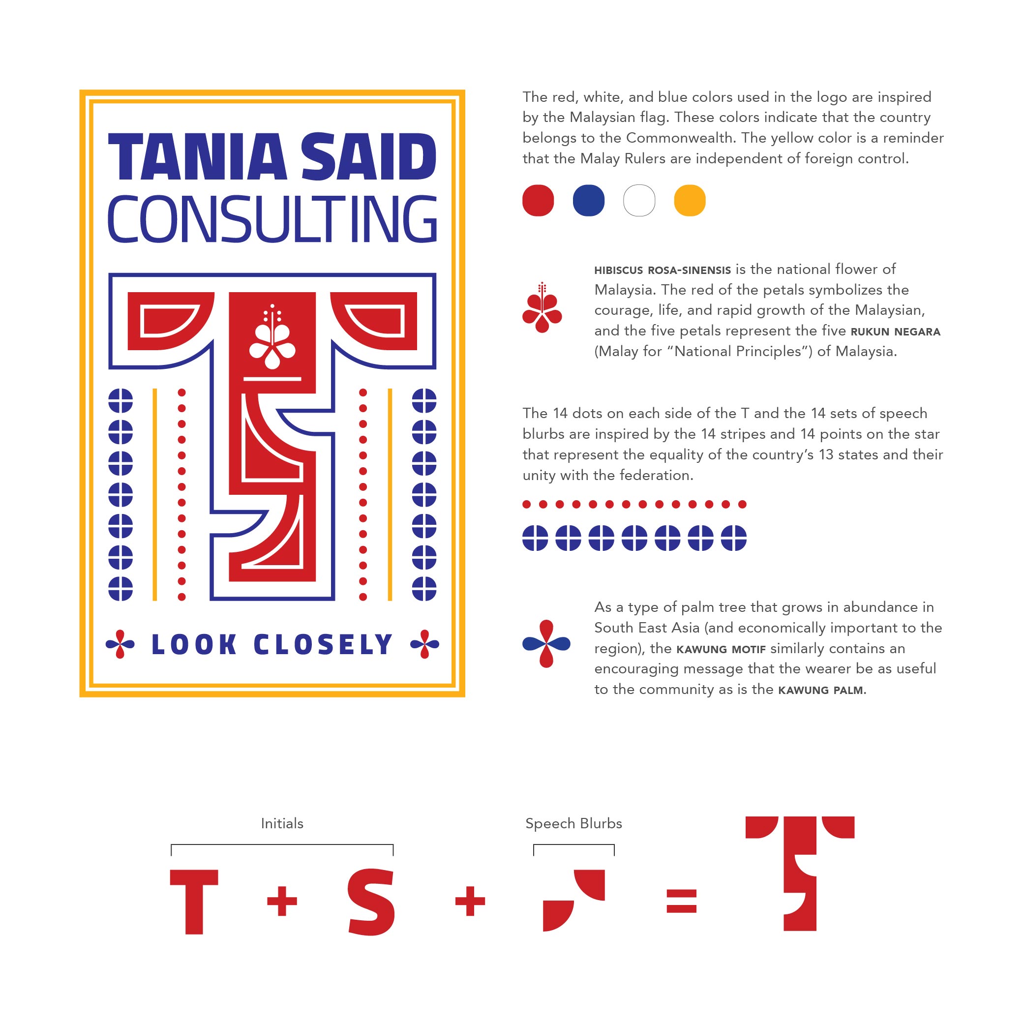
At the center of the mark is a hibiscus-inspired motif, a reference to Bunga Raya, the national flower of Malaysia. The flower celebrates Tania’s cultural roots, while the color palette draws inspiration from Malaysian, British, and American symbolism, reflecting the global perspective that informs her practice.
The identity aligns closely with the tagline, “Look Closely,” revealing layers of meaning through thoughtful symbolism while creating a distinctive and memorable brand presence.