Visual Identities (2014–Present)
This is a brief overview of some selective visual identities I have developed since 2014 and the present day.
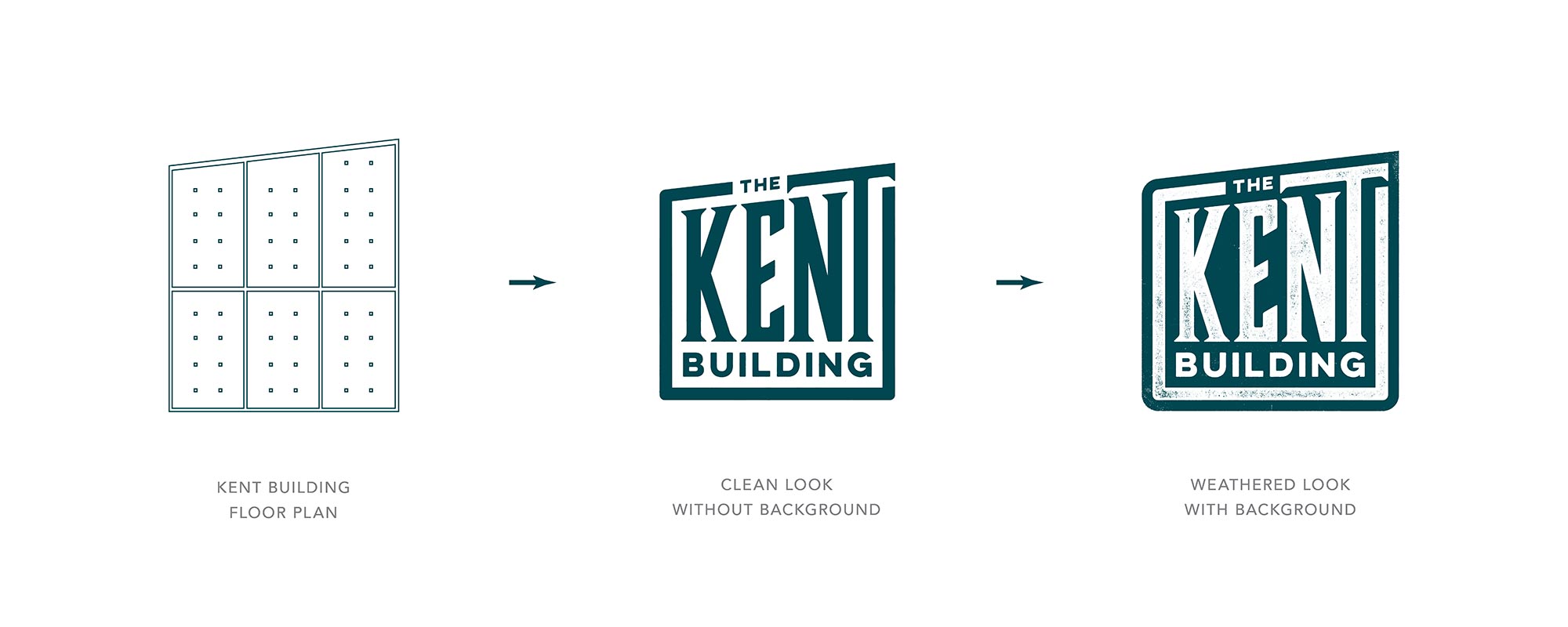
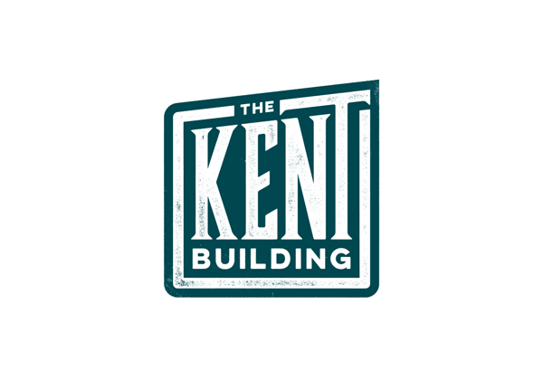
The Kent Building
Drawing inspiration from Asheville’s River Arts District’s industrial roots and artistic revival, the Kent Building brand identity pays homage to its historical significance while embracing its role as a contemporary hub for creativity and innovation. The identity features elements such as exposed brick walls, ghost signs of original advertisements, and trapezoidal floor plans, capturing the essence of the building’s architectural heritage. The logo design incorporates geometric shapes reminiscent of the building’s interior columns, symbolizing strength and adaptability.

Recognition
Graphis Design 2024 Honorable Mention
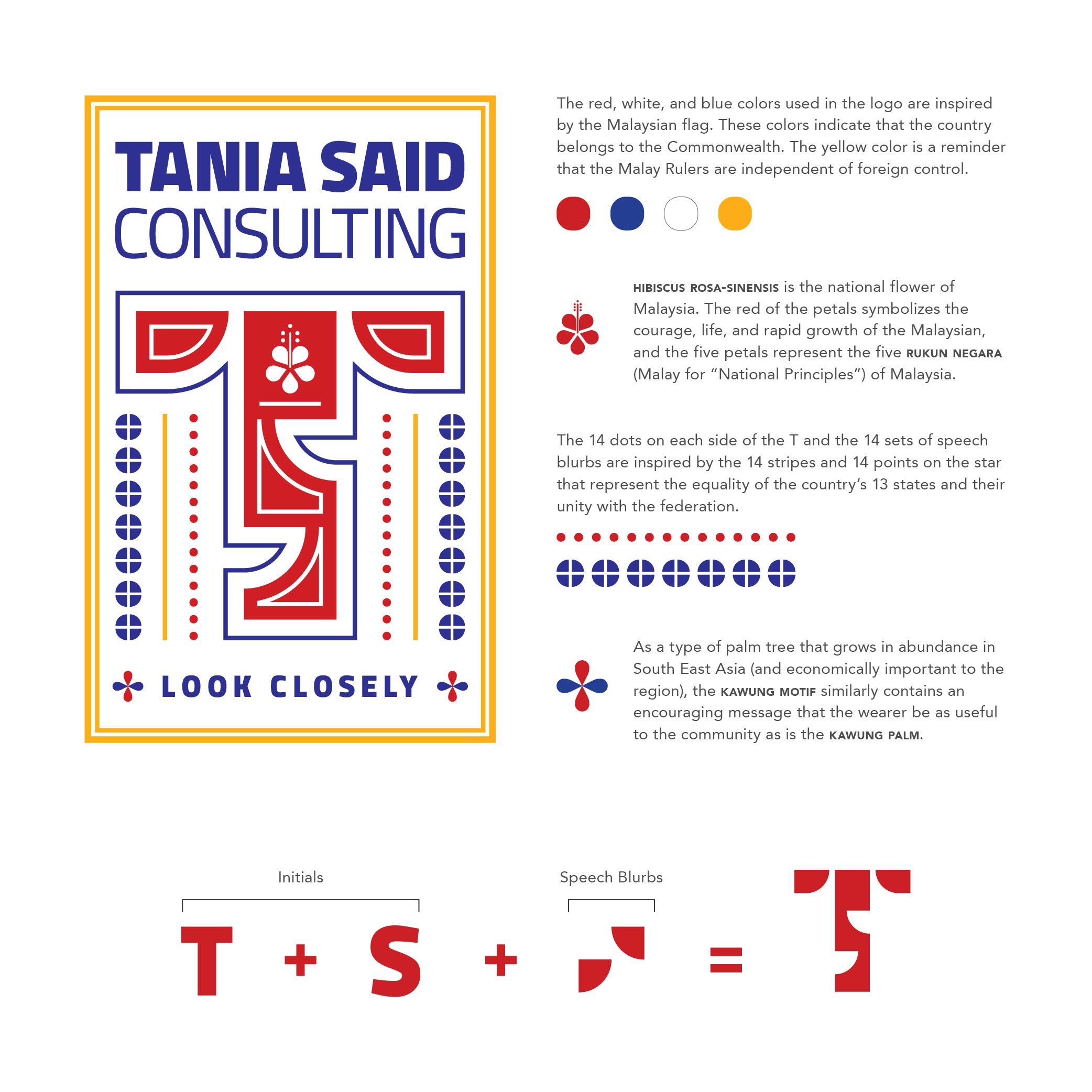
Tania Said Consulting
Drawing inspiration from the transformative journey of personal growth and healing, the identity design for Tania Said Consulting embodies the essence of hope and resilience. Rooted in Tania Said’s extensive experience and commitment to fostering positive change, the design encapsulates the idea of empowerment and inclusivity. The dominant image of the letter “T” with interconnecting mouth-like cutouts symbolizes the power of conversation and dialogue in overcoming challenges. The design reflects unity and collaboration by forming the letter “S,” representing Tania Said’s initials. Inspired by the hibiscus flower, the central floral motif pays homage to Tania’s Malaysian heritage, symbolizing courage, vitality, and cultural richness.
Recognition
Logolounge Volume 10
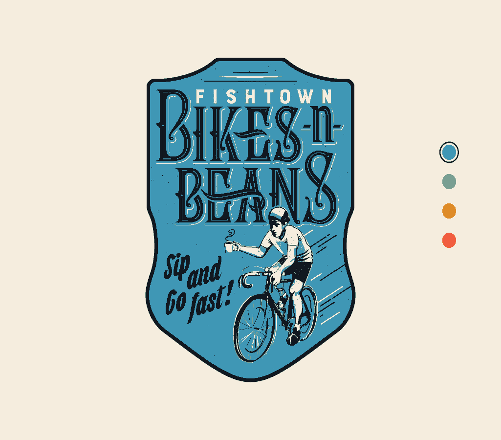
Fishtown Bikes and Beans
Inspired by the transformative experience of conversations over coffee and bikes, Fishtown Bikes and Beans’ identity embodies the spirit of hope and community. Rooted in owner JT Look’s vision to create a welcoming space where bike enthusiasts can gather, sip coffee, and share stories, the identity design reflects the fusion of two seamlessly intertwined cultures. The visual identity draws inspiration from vintage bicycle badges and incorporates a playful and dynamic design, featuring a wordmark, illustration, and tagline enclosed within a bicycle badge-shaped container.
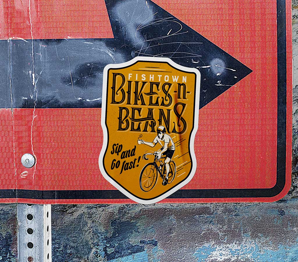
Recognition
Graphis Design 2023 Honorable Mention
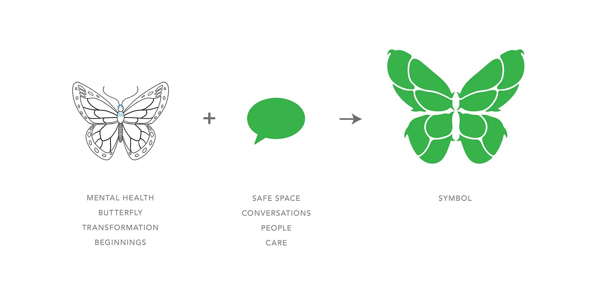
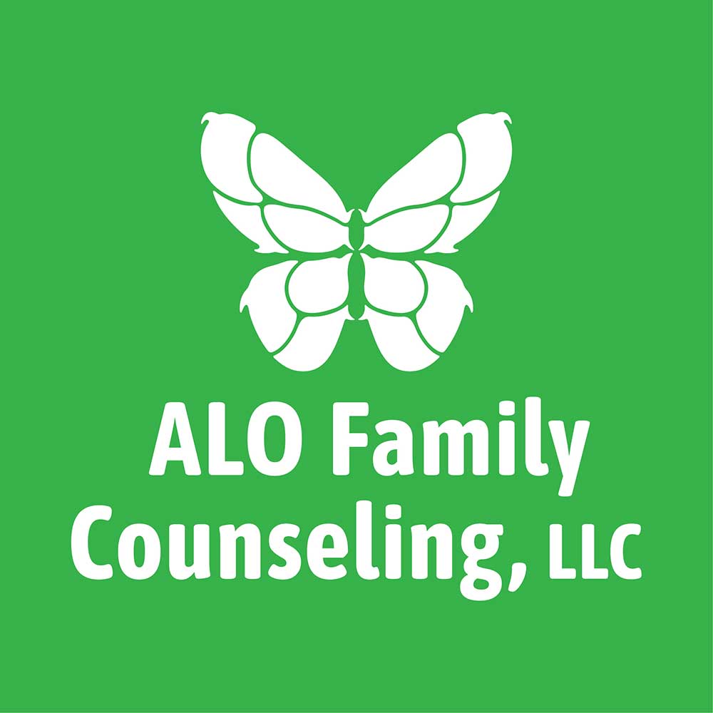
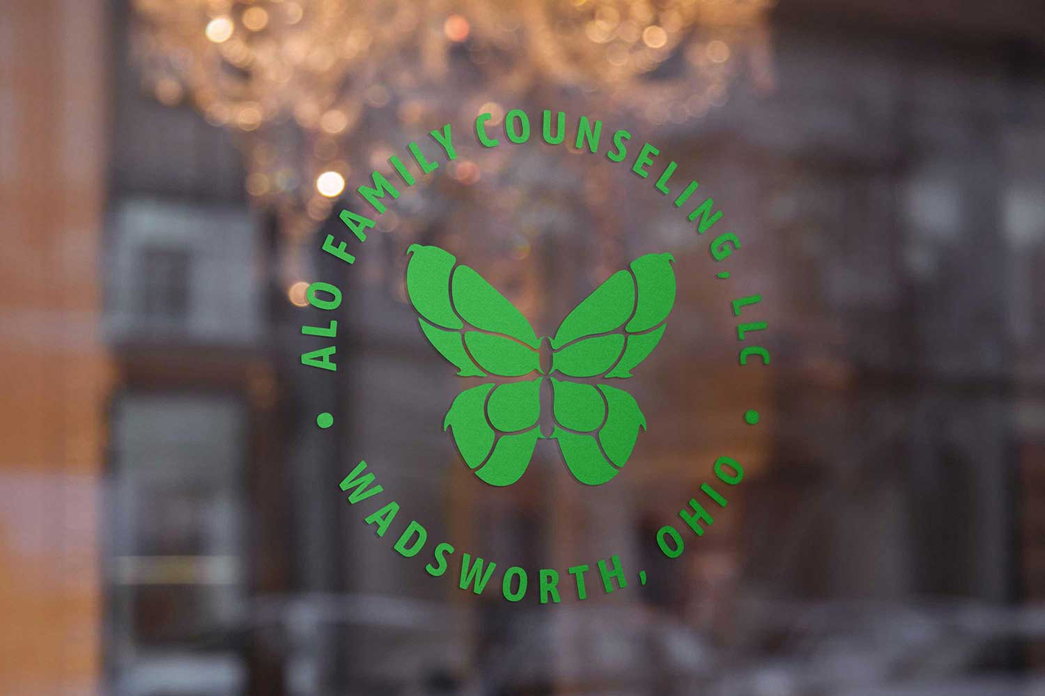
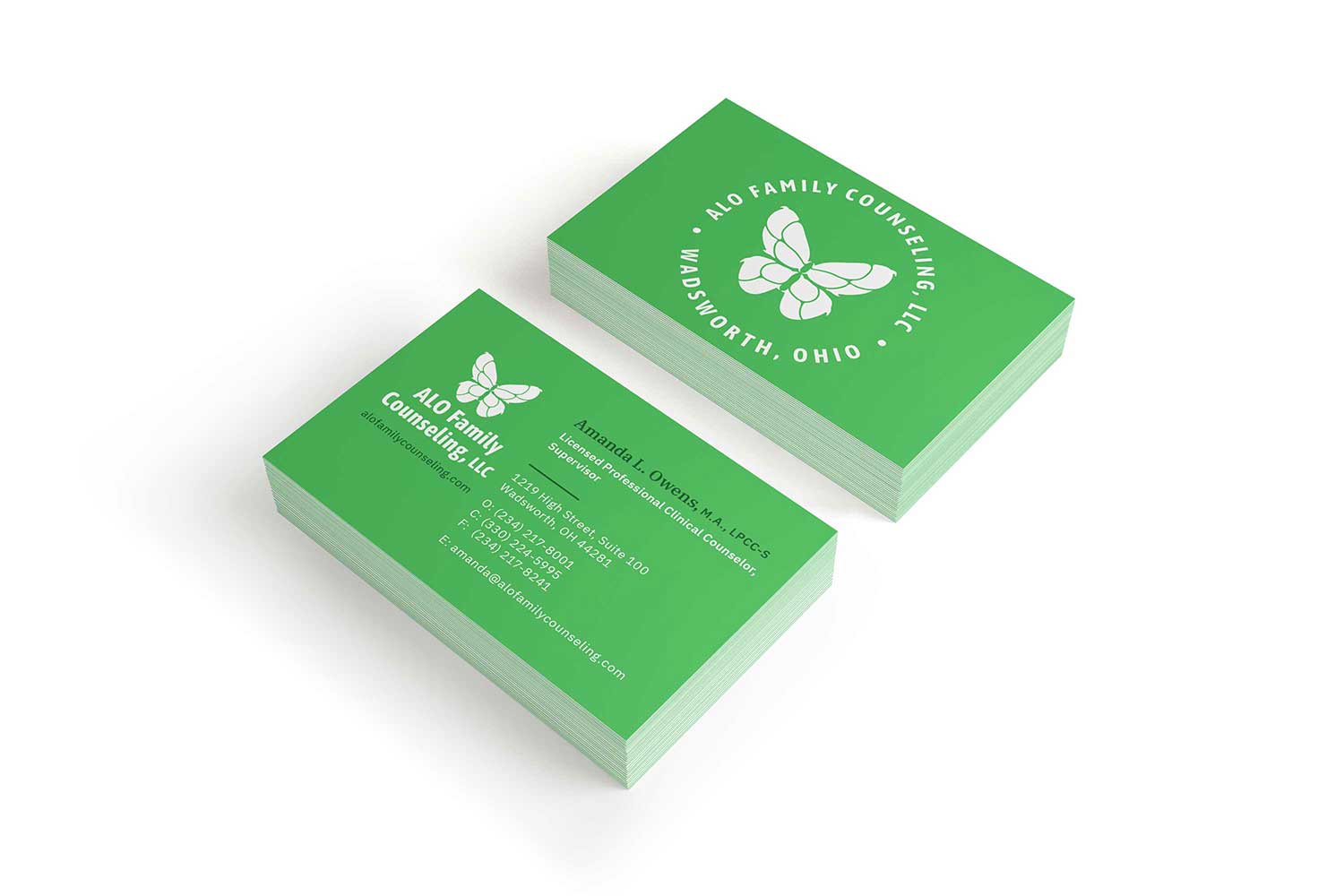
ALO Family Counseling
Inspired by the transformative nature of butterflies and the healing power of conversation therapies, the ALO Family Counseling identity represents hope for a better future with help from the right people. The speech blurbs represent diverse conversations with a trusting expert trained to help people deal with negative feelings. The identity uses the color lime green, which is associated with depression and mental health awareness.
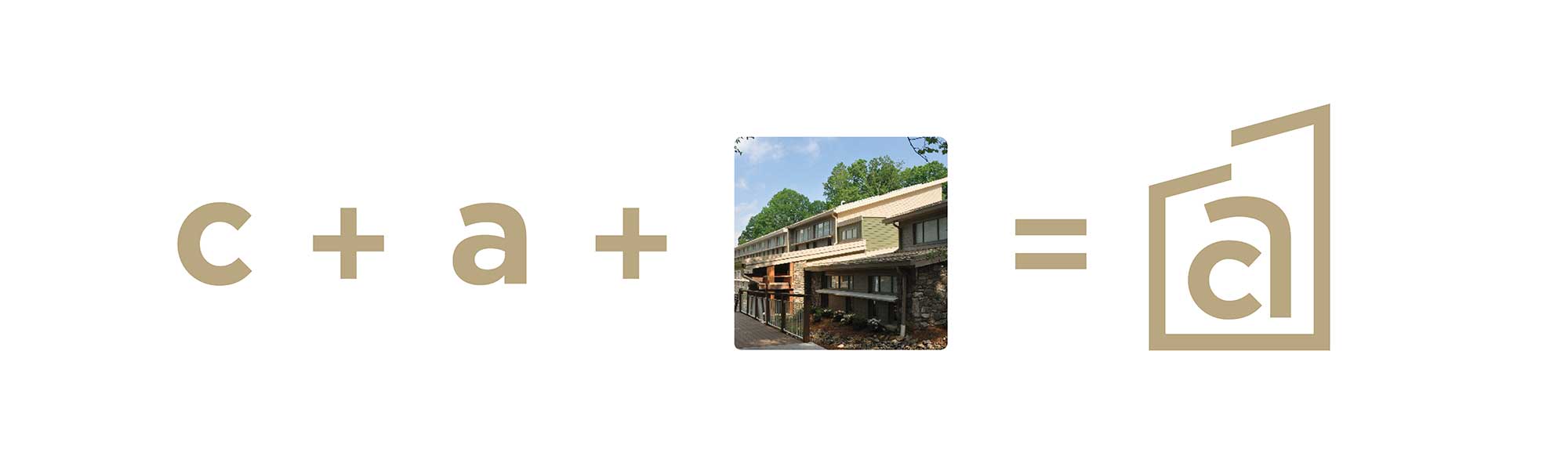
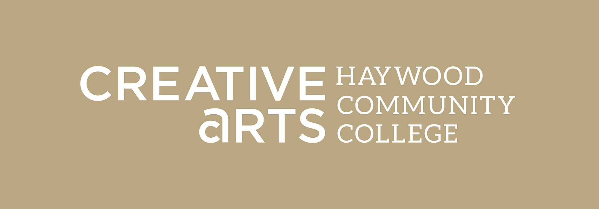
Creative Arts: Haywood Community College
Reflecting the dynamic and inclusive nature of the Creative Arts program at Haywood Community College, the identity design embodies a sense of innovation and accessibility. The monogram, featuring the letter “A” within the wordmark “Creative Arts,” visually represents the program’s commitment to creativity and collaboration. The contemporary design language, characterized by clean lines and bold typography, reflects the progressive ethos of the department. With a vibrant color palette and modern aesthetic, the identity speaks to a diverse audience of aspiring artists and creative enthusiasts, inviting them to explore and engage with the vibrant world of the arts.
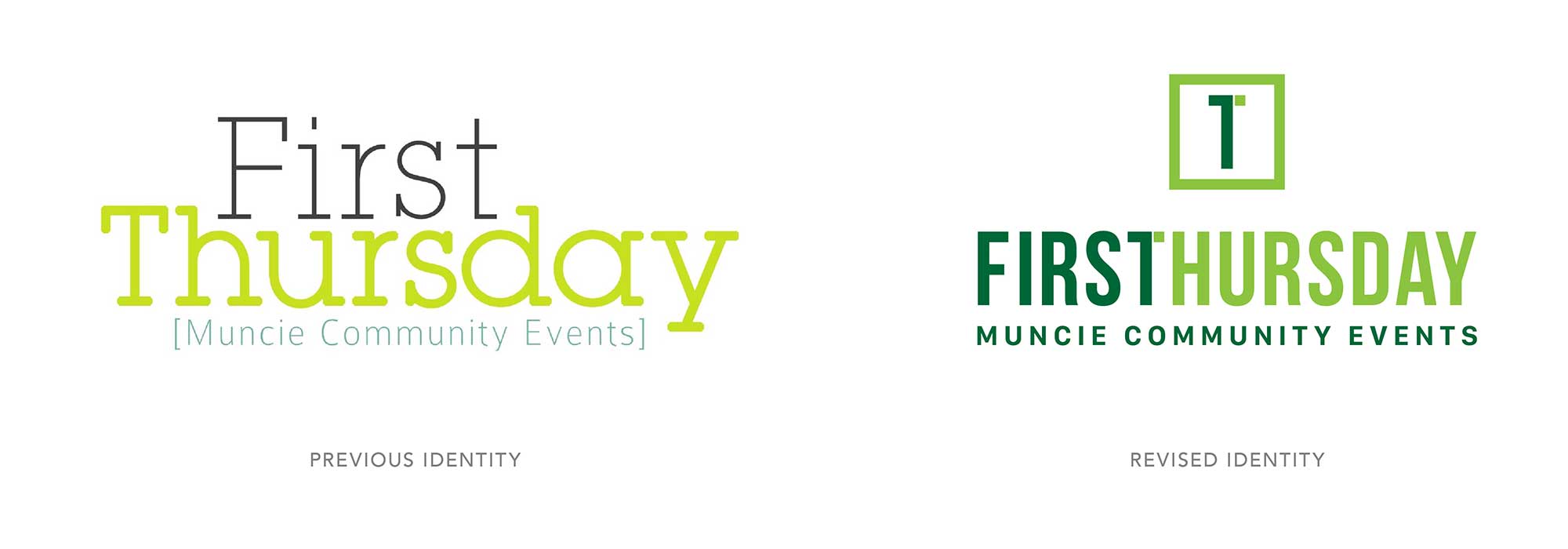
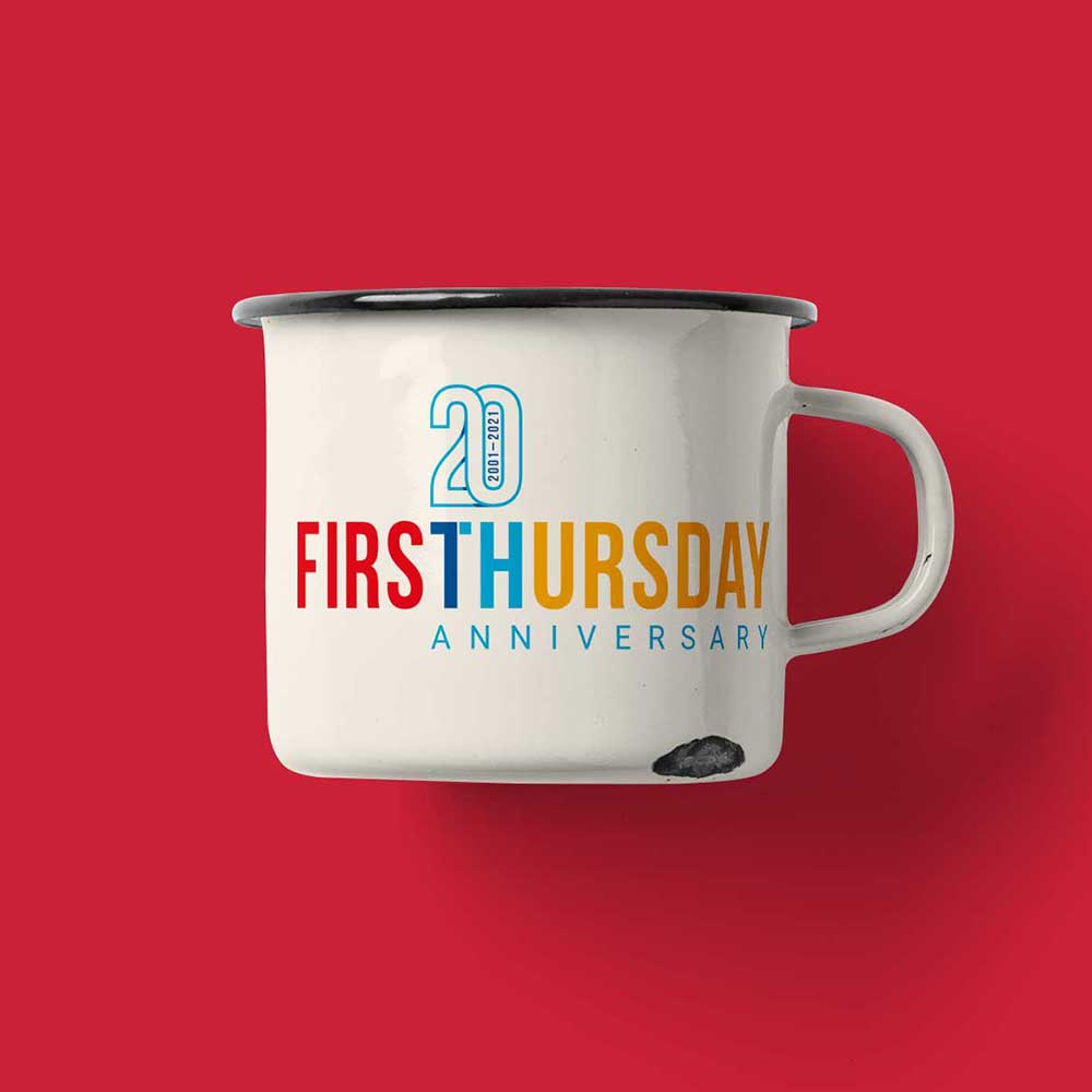
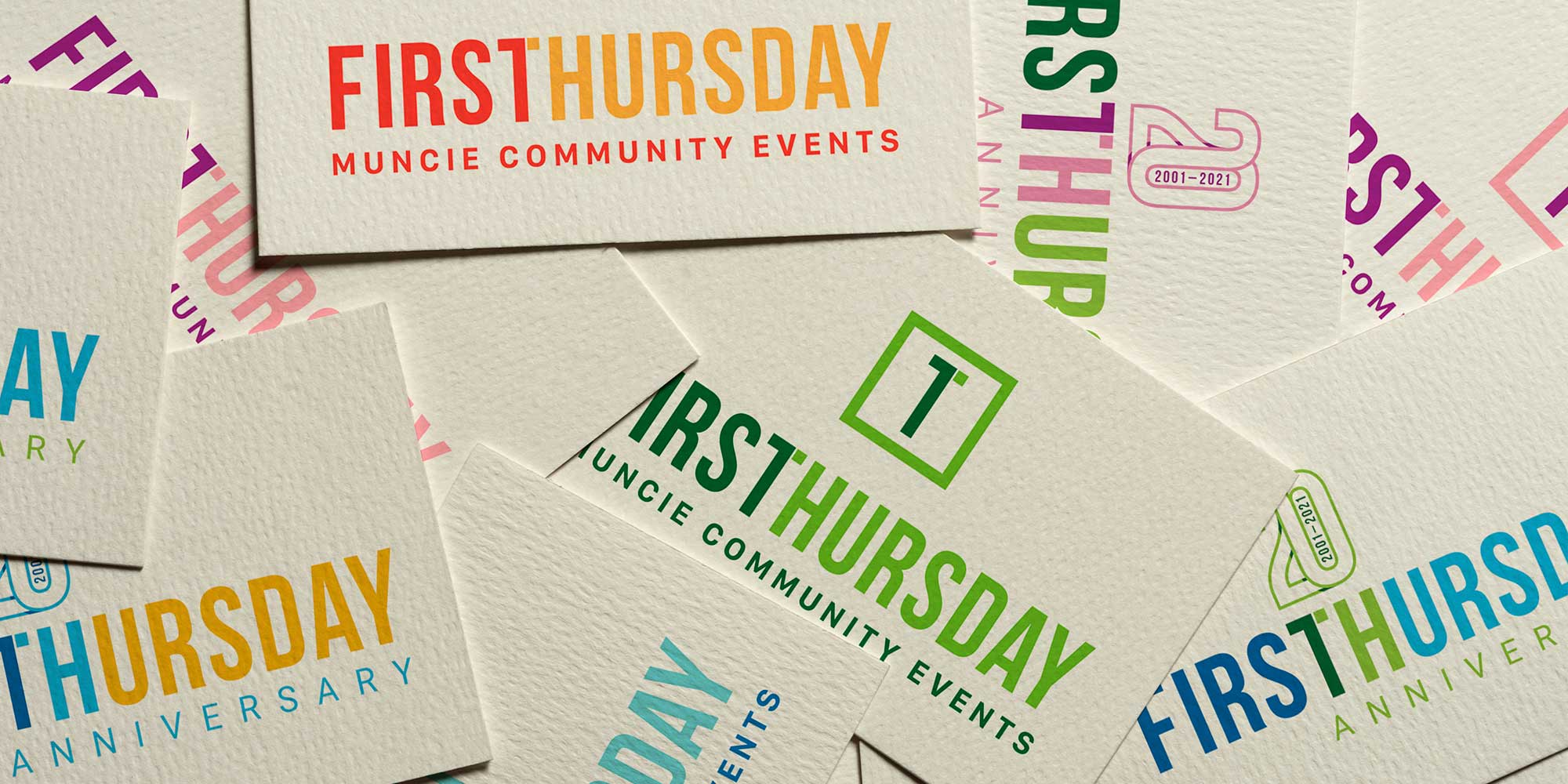
First Thursday
Since 2001, the residents of Muncie have come together every first Thursday of the month to celebrate arts and culture in Downtown Muncie. When tasked with creating an identity for this community event, rather than drawing inspiration from specific artistic or cultural elements, I opted for a neutral yet memorable design. I crafted a monogram combining the number 1 and the letter “T” to represent the significance of the first Thursday. The design was executed in four color combinations, each symbolizing a different year’s season. Upon the event’s 20th anniversary, I approached the design with a playful twist, incorporating the first two letters, “T” and “H,” from the word “Thursday” to subtly connect it with the milestone of 20 years.
Recognition
Graphis Design 2023 Silver Award
GDUSA Health + Wellness Award 2020
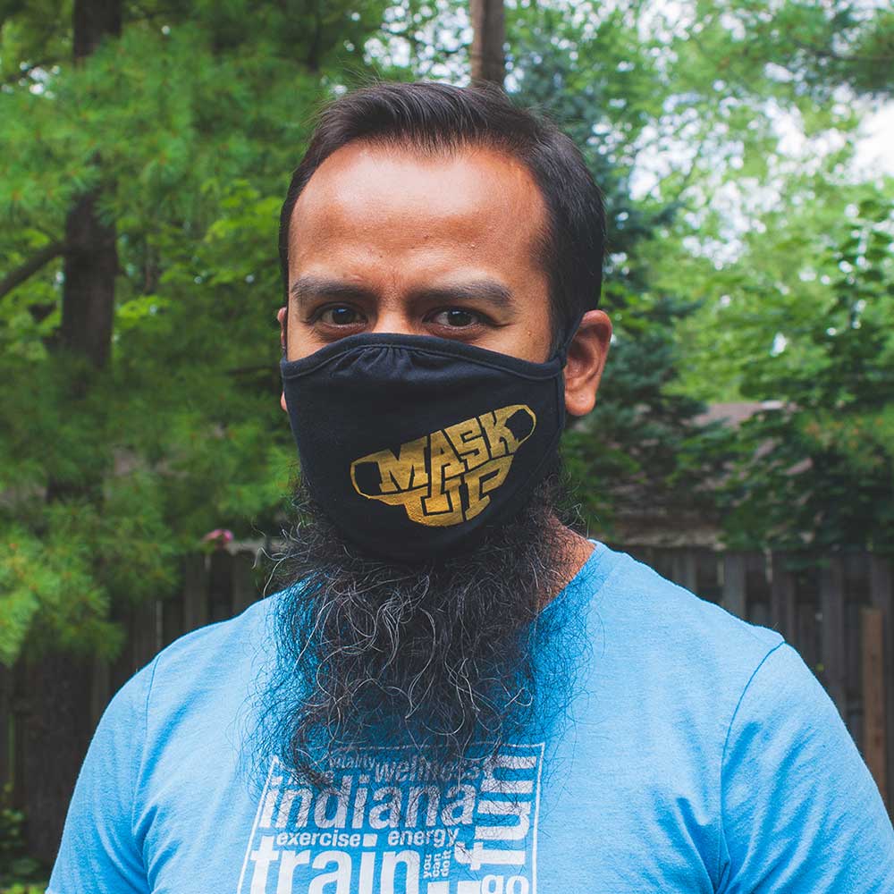
Mask Up Muncie
In response to the urgent need for mask-wearing during the COVID-19 pandemic, Mask Up Muncie emerged as a visual typographic solution to encourage compliance with public health guidelines. The identity design, shaped like a mask, was a visual reminder for individuals to prioritize safety measures such as wearing masks and practicing social distancing. Implemented across various mediums, including masks, yard signs, and social media platforms, the design aimed to foster a sense of community responsibility and solidarity in Muncie, Indiana, and beyond. The initiative garnered widespread support, with residents from neighboring cities requesting its adoption, demonstrating its effectiveness in promoting public health awareness and adherence to safety protocols.

Recognition
Logolounge Volume 9
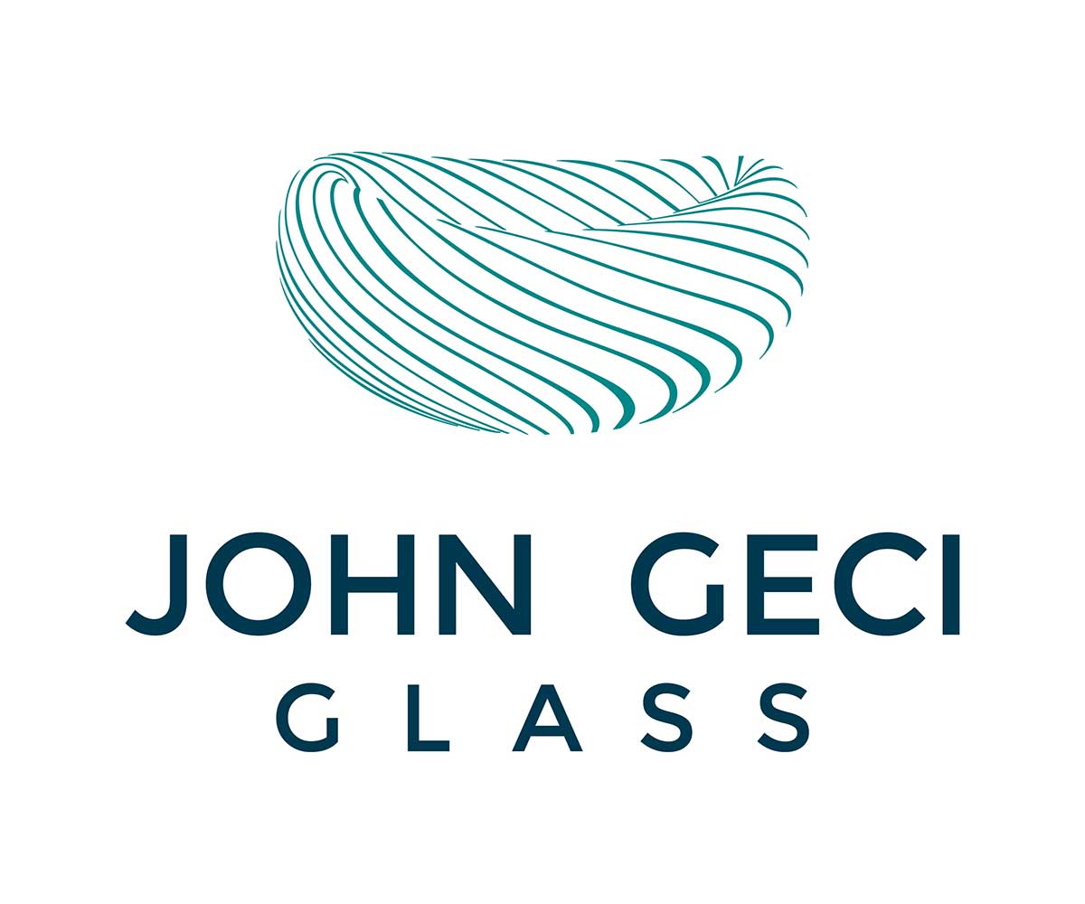
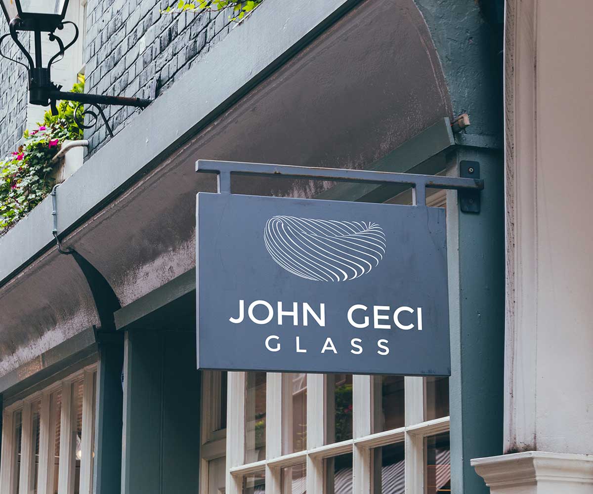
John Geci Glass
As a master of glass artistry nestled in the heart of Bakersville, NC, John Geci’s identity exudes elegance and craftsmanship. Inspired by the intricate designs of Geci’s signature” Eclipse” bowl, the visual identity captures the essence of his work with its fluid lines and delicate detailing. The transparency of the glass and the rhythmic caning patterns evoke a sense of depth and sophistication, reflecting Geci’s dedication to precision and artistry.
Recognition
GDUSA Packaging Design Award 2024
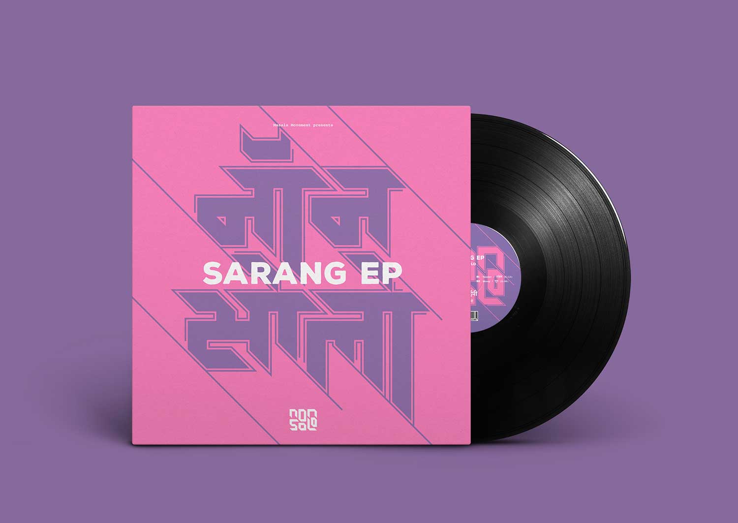
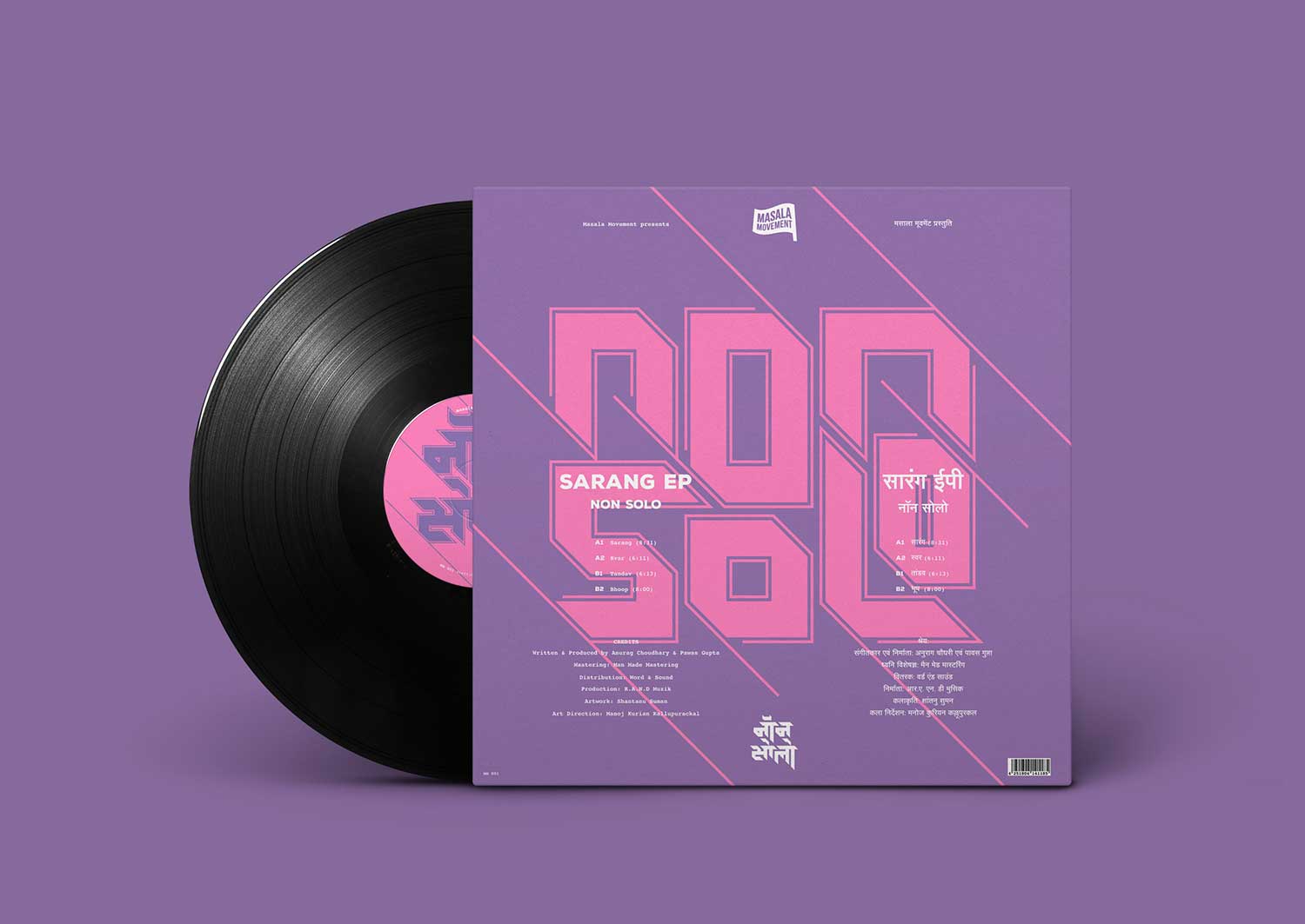
Non-Solo Sarang
Non-Solo’s EP “Sarang” showcased a remarkable collaboration between Indian musicians Anurag Choudhary and Pawas Gupta, blending Indian classical and electronic rhythms. The primary aim was to visually capture the spirit of their music through the design of a vinyl record cover. To pay homage to the rich heritage of Indian classical music, a custom Hindi typeface was created specifically for the band’s name, Non-Solo. This typography serves as a nod to tradition while also embodying a geometric, minimalist, and futuristic style, mirroring the duo’s inventive fusion of musical styles. The vinyl cover prominently features this Hindi typeface, acting as a visual representation of the convergence between tradition and innovation.
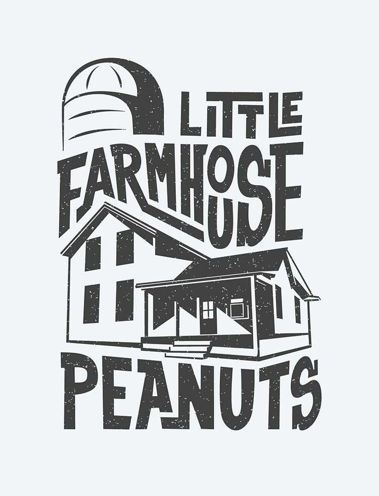
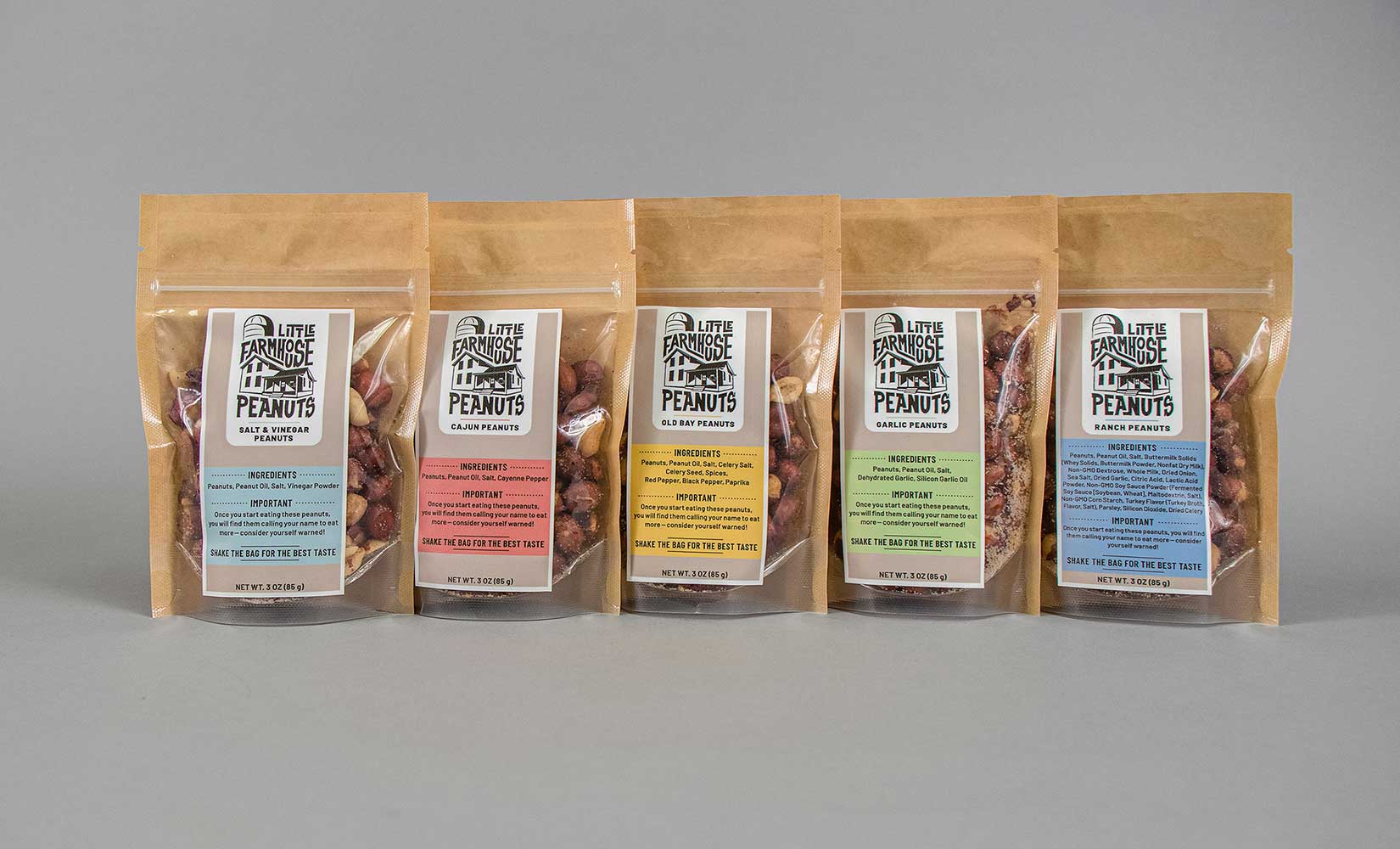
Little Farmhouse Peanuts
Taking cues from the rustic-charm of Amy Fluke’s family-owned business in McFarland, Wisconsin, this identity encapsulated the essence of the countryside. With charming illustrations of the farmhouse and grain silo, it reflects the heart of the business at its core.